
今天的挑戰一直在我的寫作榜上。感謝 Business Bloomer 的一位訂閲者,我終於決定發佈一個快速教程。以下是將 「產品庫」 縮略圖與主單頁產品頁面圖像對齊的方法,無論設備如何。
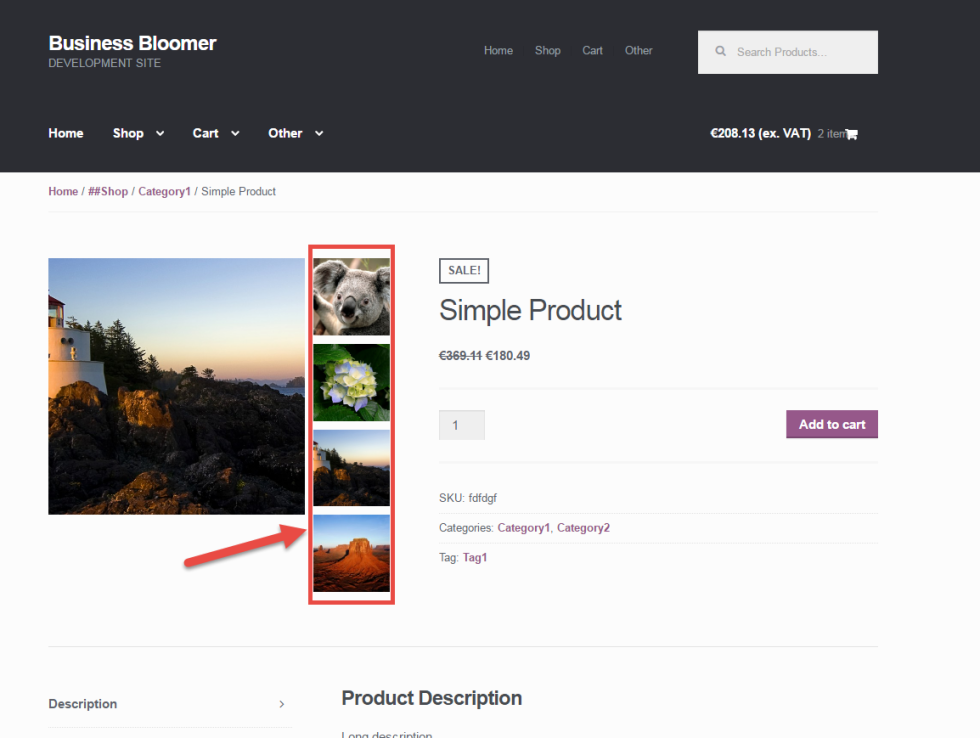 WooCommerce:在主圖像旁邊顯示單個產品縮略圖
PHP Snippet(第 1 部分,共 2 部分):更改 WooCommerce 產品庫列的數量
首先,如果我們要垂直顯示,我們需要確保我們的產品庫每行有 1 個圖像 (如果沒有錯誤,默認為 3) 。
/** * @snippet Change Gallery Columns @ Single Product Page * @sourcecode https://businessbloomer.com/?p=20518 * @author Rodolfo Melogli * @testedwith WooCommerce 2.5.5 */ add_filter ( 'woocommerce_product_thumbnails_columns', 'bbloomer_change_gallery_columns' ); function bbloomer_change_gallery_columns() { return 1; } // --------------------- // For Storefront theme: add_filter ( 'storefront_product_thumbnail_columns', 'bbloomer_change_gallery_columns_storefront' ); function bbloomer_change_gallery_columns_storefront() { return 1; } // --------------------- CSS Snippet(第 2 部分,共 2 部分):編輯 WooCommerce 產品庫 CSS
其次,我們需要將產品庫 「移動」 在圖像旁邊。這是您可以放置在您的孩子主題樣式表中的基本 CSS 。
/** * @snippet CSS to Move Gallery Columns @ Single Product Page * @sourcecode https://businessbloomer.com/?p=20518 * @author Rodolfo Melogli * @testedwith WooCommerce 2.5.5, Storefront 1.6 */ @media (min-width: 0px) { /* Make image 75% width to make room to its right */ .single-product div.product .images .woocommerce-main-image { width: 75%; float: left; } /* Make Gallery 25% width and place it beside the image */ .single-product div.product .images .thumbnails { width: 25%; float: left; } /* Style each Thumbnail with width and margins */ .single-product div.product .images .thumbnails a.zoom { width: 90%; float: none; margin: 0 0 10% 10%; } } 如何添加此代碼?
1 、您可以將 PHP 代碼片段放置在主題或子主題的 functions.php 文件的底部 (如果是 CSS 代碼,請添加到子主題的 style.css 文件底部) 修改之前建議先備份原始文件,若出現錯誤請先刪除此代碼。
2 、 WordPress 4.9 後改進了主題編輯器,對於 CSS 代碼也可打開網站前台編輯器的 【自定義】,複製代碼添加到自定義 css 中。
此代碼是否可用?
如需幫助或是您有更好的方案想分享?請到薇曉朵 WooCommerce 中文論壇留言告知,我們希望可以幫到更多國內的 WooCommerce 用户也希望您的參與。

